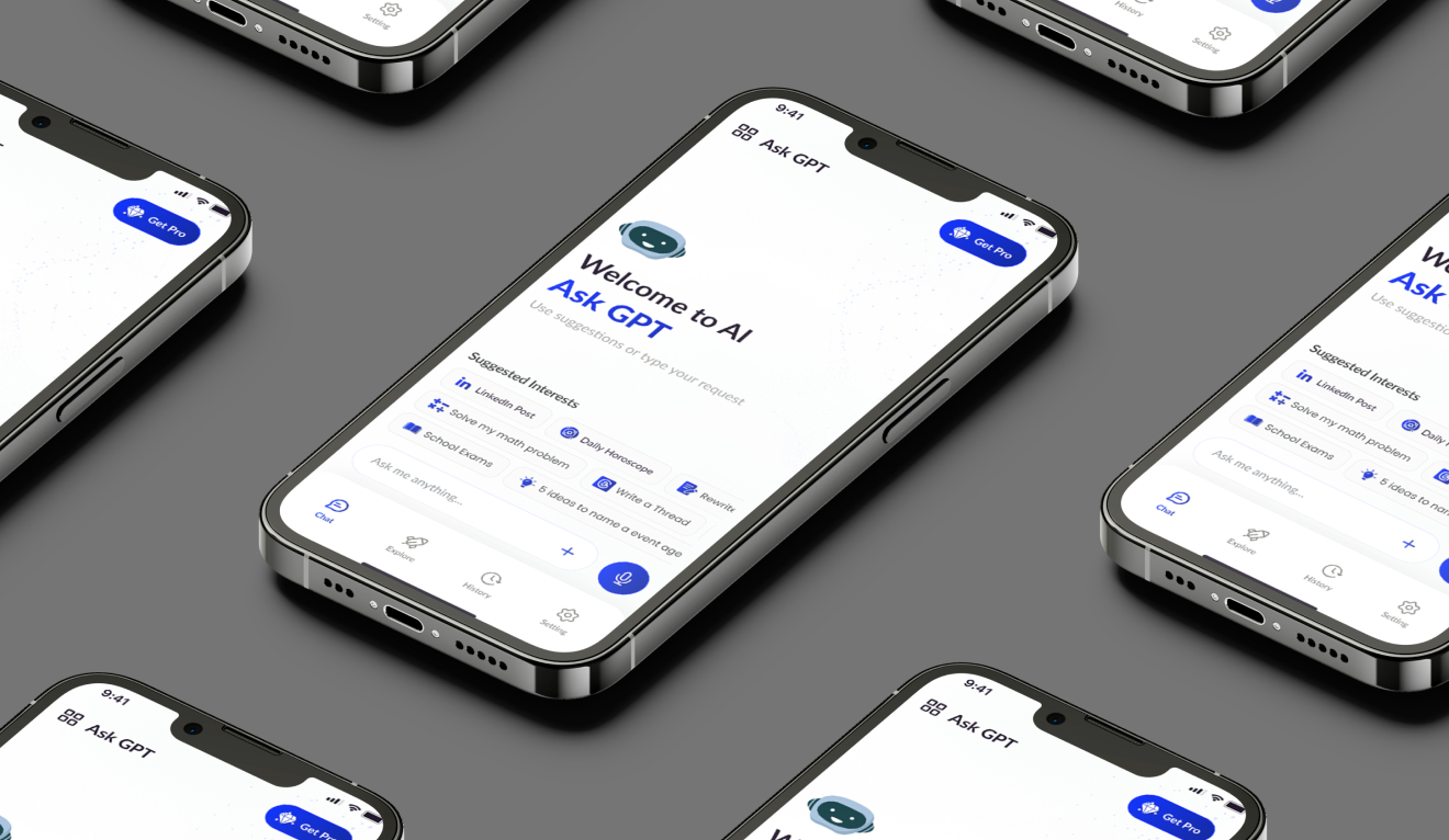
( Ask GPT ) Simplifying AI for Everyday Use, from Problem Identification to Final Product
Project Details
"Ask GPT" with a clear vision to create a seamless and engaging user experience that combines the power of AI with a clean, intuitive interface. The project focused on integrating advanced AI features—such as real-time chat, personalized recommendations, and educational tools—into an app that feels familiar and easy to navigate. By doing so, the project aimed to empower users, allowing them to tap into the vast knowledge and capabilities of AI.
The project was conceived to address the growing gap between the potential of AI and its usability for the general public. The project’s mission was to design an AI assistant that to understand artificial intelligence and makes it a valuable tool in the hands of everyday users. By focusing on user-centered design principles, the project aimed to simplify the interaction .
The Problem Statement
As a UX/UI designer, Recognized that the potential of Artificial Intelligence (AI) is vast, yet its complexity often alienates the average user. Many AI platforms are built with a focus on functionality, often at the expense of usability, leaving everyday users feeling overwhelmed by intricate interfaces and technical language. This disconnect between powerful technology and user accessibility presents a significant design challenge.
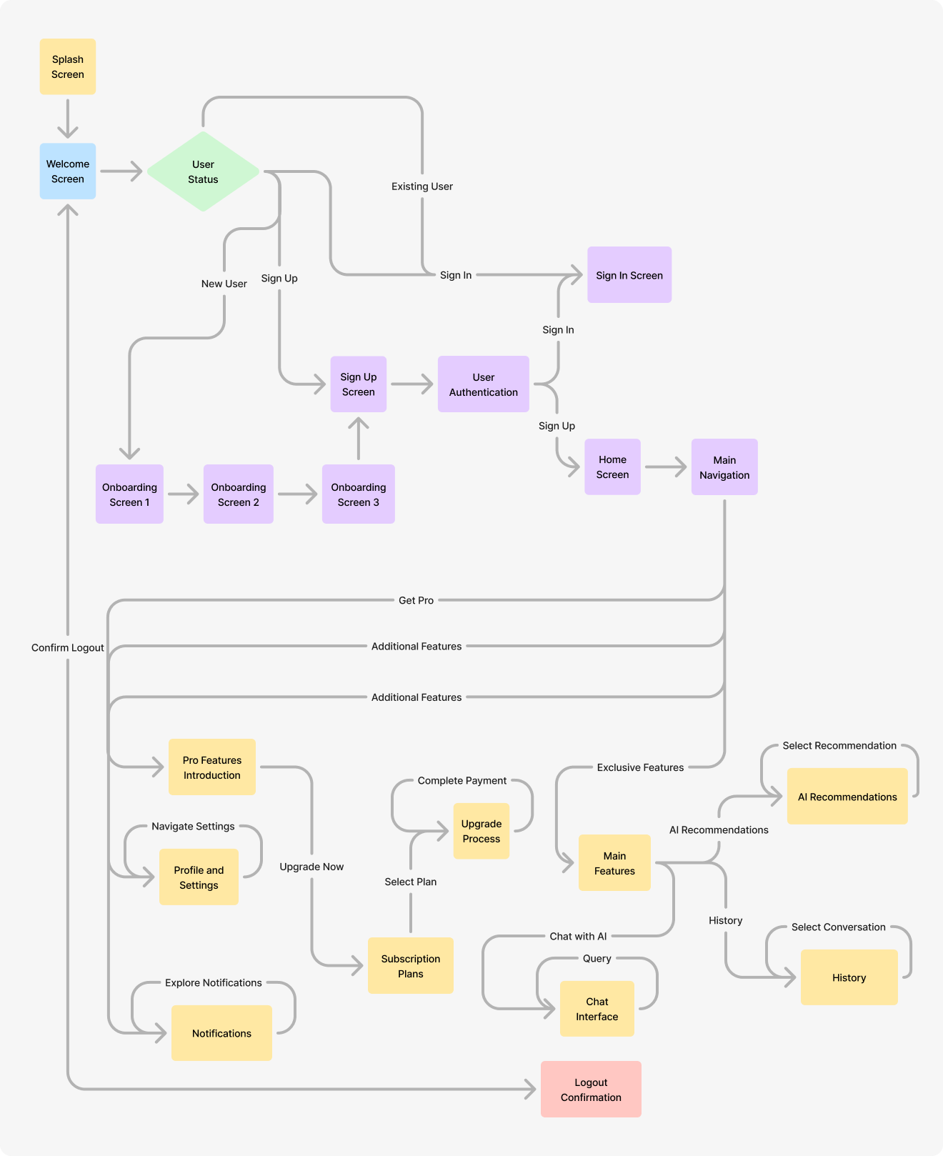
Defining The Challenges
The Goals & Targets
01
Enhance Usability
Design an interface that is intuitive and easy to navigate, ensuring users of all technical backgrounds can interact with the AI.
02
Boost User Engagement
Create a user experience that encourages frequent interaction with the app, making it an indispensable tool in users' daily lives.
03
Build User Trust in AI
Establish confidence in the AI capabilities by ensuring that the responses are accurate, relevant, and transparent.
04
Promote Accessibility
Ensure that the app is accessible to all users, including those with disabilities, to best practices in inclusive design.
User Research
.png)
.png)
.png)
.png)
Findings
Simplicity is Key:
Users want an app that is straightforward and easy to navigate without a steep learning curve.
Accuracy Matters:
People expect the AI to give them accurate and relevant answers every time.
Engagement Drives Use:
Features like voice input, personalized suggestions, and a user-friendly design can significantly increase user engagement.
Brainstorming
User-Friendly:
Simple, clear, and easy to use.
Engaging:
Features that keep users coming back, like personalized recommendations and voice interaction.
Flexible:
Capable of catering to both casual users and those with more serious learning goals.
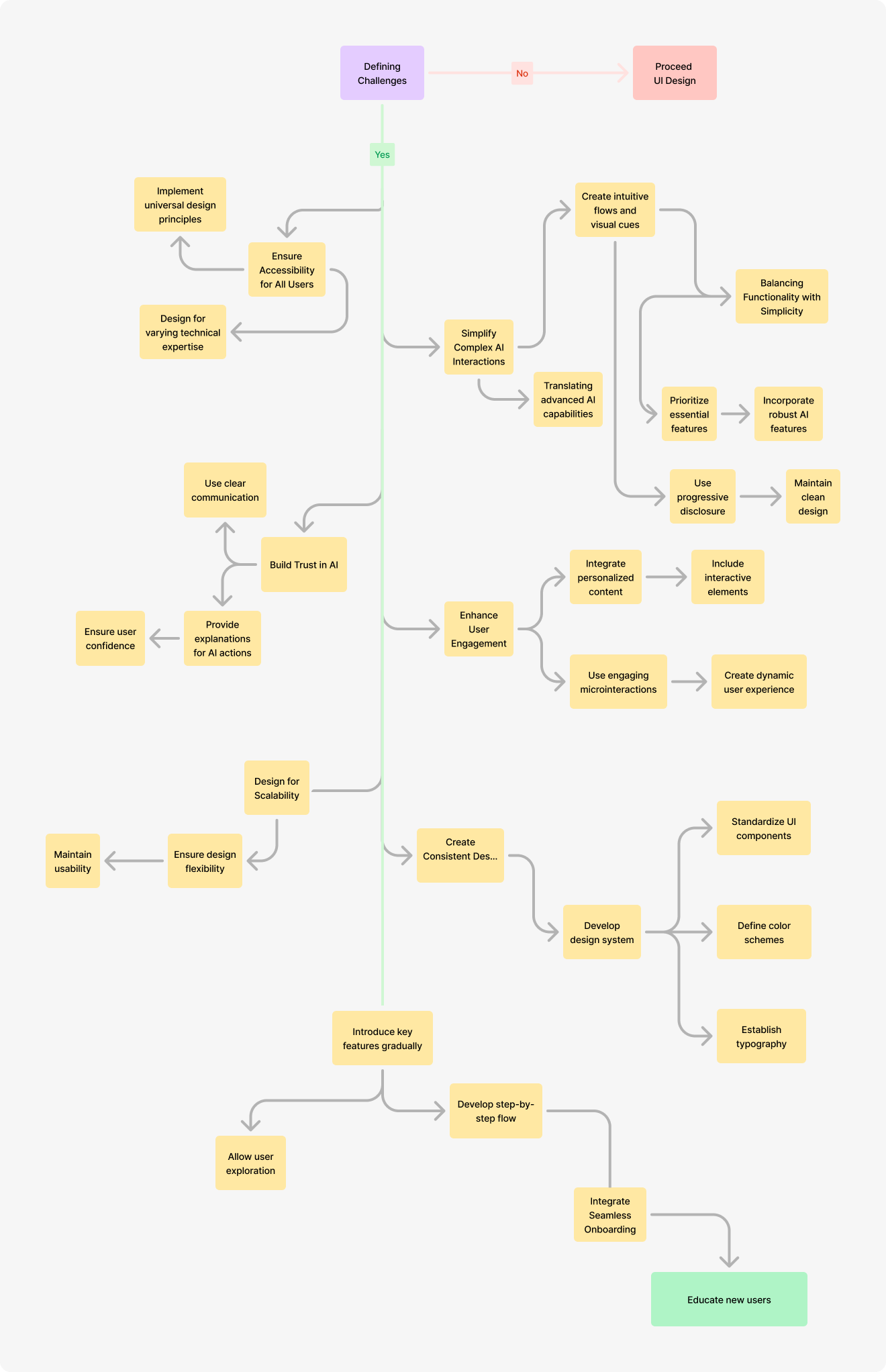
User Flow
The user flow was designed to be as intuitive as possible, guiding users from the home screen through different features based on their needs
Wireframing
Wireframes are essential in the design process as they provide a visual blueprint of the app’s structure and layout before delving into detailed design.


Many More...
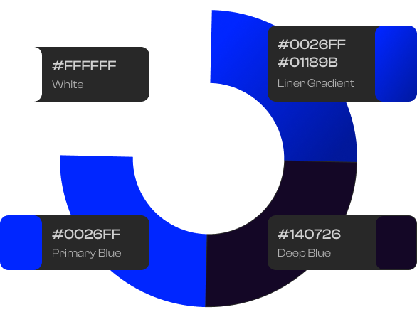
Color Theory
#0026FF #01189B (Liner Gradient)
This linear gradient, transitioning from a vibrant blue (#0026FF) to a deep navy blue (#01189B), forms the core of the app’s visual identity. Used in buttons to make them stand out, encouraging user interaction.
#FFFFFF (White)
A clean, neutral color used throughout the app to balance the vibrant blues and ensure readability. Used for primary text on dark backgrounds and within buttons to maintain contrast and legibility.
#0026FF (Primary Blue)
A bold, pure blue used as a standalone color for key elements that require user attention. Applied to icons, links, and other interactive elements to guide user actions.
#140726 (Deep Indigo)
A deep, rich shade of indigo used as an accent to add contrast and depth. Applied in modal windows, overlays, or as a backdrop for key UI components.
Typography
Primary Font
Lato
Lato is a humanist sans-serif fontKnown for its clean, modern appearance with a touch of warmth, Lato features slightly rounded letterforms and a balanced structure that combines readability with a friendly character. Lato was selected for its legibility, professional appearance, and adaptability across different screen sizes and resolutions.It combines round, soft edges with a strong, geometric structure, making it both approachable and professional.The font's design is optimized for digital interfaces, ensuring excellent readability on screens of all sizes, from mobile devices.
A B C D E F G H I J K L M N O P Q R S T U V W X Y Z
A B C D E F G H I J K L M N O P Q R S T U V W X Y Z
1 2 3 4 5 6 7 8 9 0
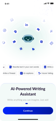
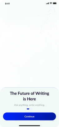
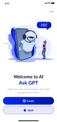
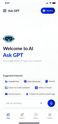
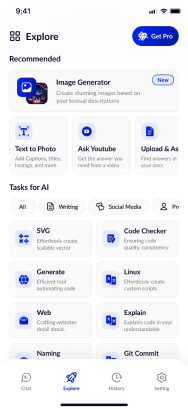
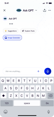
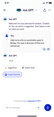
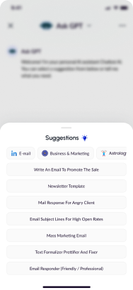
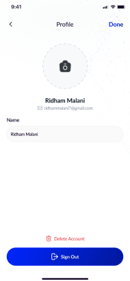
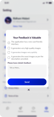
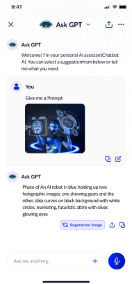
Final UI Design
The final design of "Ask GPT" user-centered design principles and resulting in a polished, intuitive interface that meets the needs of diverse users.






Many More...
Conclusion
As a UX/UI Designer, working on the "Ask GPT" project was a transformative experience that allowed me to blend the power of AI with human-centered design principles. The journey from identifying user pain points to delivering a polished, intuitive final product was both challenging and rewarding. Here's what I took away from this project
Figma Link Saikiran chilkamari