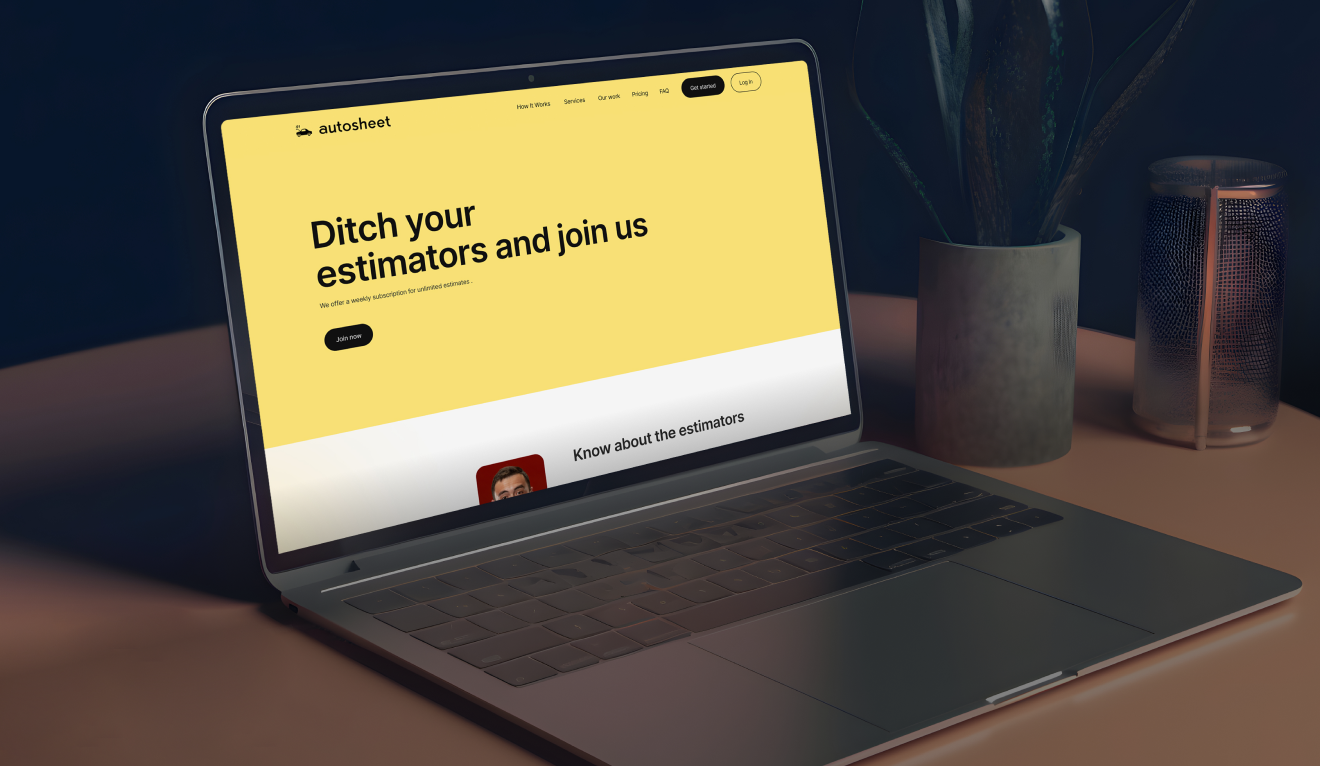
( Autosheet ) Building a Comprehensive Insurance Estimation Platform from Scratch
Project Details
When we were approached to create "The Estimator Based on Insurance," our mission was clear to design a platform from scratch that would streamline the complex tasks of vehicle estimators and auditors. These professionals are responsible for assessing damage, calculating repair costs, and ensuring accurate insurance claims. They often have a lot on their plates, and our goal was to give them a tool that makes their jobs easier and more efficient.
This project wasn't just about creating software it was about solving real problems that these professionals face daily. We wanted to deliver a platform that was not only powerful but also intuitive and user-friendly, helping them save time and avoid the frustrations that often come with complicated systems.
The Problem Statement
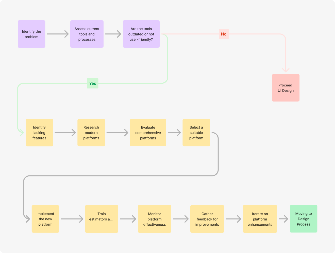
The insurance estimation process can be time-consuming. Estimators and auditors are required to assess vehicle damages, calculate repair costs, and process a large amount of data, all while adhering to strict timelines. The tools available to them were either outdated, not user-friendly, or lacked the necessary features to make their work easier. The need was for a modern, comprehensive platform that could address these challenges head-on.
Defining The Challenges
The Goals & Targets
01
Efficiency
Develop a platform that significantly reduces the time required to estimate and audit vehicle damages.
02
Accuracy
To ensure that the platform supports accurate data entry and calculation to minimize errors in insurance claims.
03
User Friendliness
Design an intuitive interface that requires minimal training, allowing users to start working effectively from day one.
04
Scalability
To create a system that can easily adapt to different user needs and expand with new features as required.
User Research
.png)
.png)
.png)
.png)
Findings
Complexity and Clutter:
Current tools were often overloaded with features that users didn’t need, making the software difficult to navigate.
Lack of Integration:
Users had to switch between multiple platforms to complete their tasks, leading to inefficiencies. to navigate.
Time-Consuming Data Entry:
The process of entering data was tedious and prone to errors, leading to delays and mistakes in insurance claims. to navigate.
Poor Mobile Usability:
Many existing tools weren’t optimized for mobile use, which was a problem for professionals who needed to work on the go. to navigate.
Brainstorming
Simplifying the User Experience:
Reducing clutter and focusing on the essential features.
Integrating Processes:
Creating a seamless workflow where users could manage everything from one platform.
Automating Data Entry:
Implementing features that reduce manual data entry and the risk of errors.
Mobile Optimization:
Ensuring the platform worked just as well on mobile devices as it did on desktops.
User Flow
It guides users through the platform efficiently, from the initial landing page to the completion of tasks like creating estimates, conducting audits, and generating reports. Each step is crafted to ensure users can navigate the platform with ease, maximizing productivity and minimizing complexity.

Wireframing
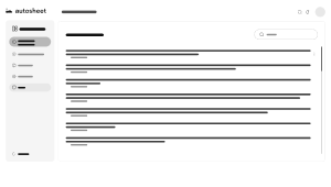
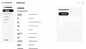
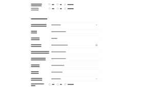
Started with basic wireframes to outline the layout and flow. This helped us focus on functionality without getting distracted by visual design.





Many More...
Color Theory
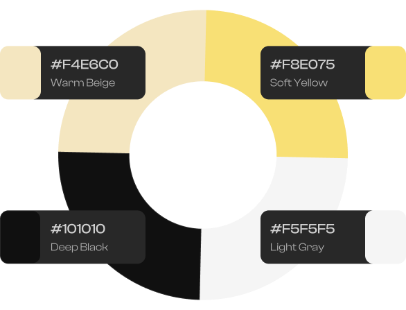
#F8E075 (Soft Yellow)
This color could be used for highlights, or areas where attention needs to be gently drawn. It's a friendly and inviting shade that can create a welcoming atmosphere for users.
#F5F5F5 (Light Gray)
This color is ideal for backgrounds or areas where content needs to be the focus without the distraction of vivid colors. It helps maintain a minimalistic and clean design.
#F4E6C0 (Warm Beige)
This color can be used in sections where want to evoke a sense of trust and comfort, such as in forms, backgrounds, or secondary buttons. It works well to complement more vibrant colors without overwhelming the design.
#101010 (Deep Black)
This color is excellent for text, headers, or elements that need to stand out sharply against lighter backgrounds. It creates a clear, readable, and professional look that can anchor the design.
Typography
Primary Font
Inter
Inter is a popular sans-serif font designed by Rasmus Andersson, specifically optimized for use on screens. It is known for its clean, modern design and excellent readability across various devices and resolutions. Inter features a tall x-height, open apertures, and slightly rounded corners, contributing to its clarity and legibility, especially at small sizes.
The typeface includes a wide range of weights and styles, from thin to black, with corresponding italics, providing flexibility for different design applications. It also supports a broad range of languages and includes advanced typographic features such as ligatures, tabular numbers, and more. Inter is widely used in web design, user interfaces, and digital content, making it a go-to choice for projects that require a contemporary, highly legible typeface.
A B C D E F G H I J K L M N O P Q R S T U V W X Y Z
A B C D E F G H I J K L M N O P Q R S T U V W X Y Z
1 2 3 4 5 6 7 8 9 0
Final UI Design
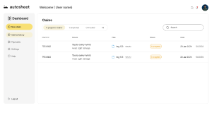
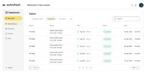
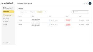
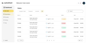
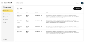
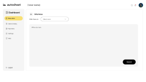
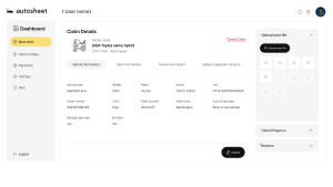
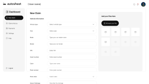
Once the wireframes and design system were in place, we moved on to detailed UI design. Prototypes were created to test the user experience, allowing us to make adjustments based on feedback. The final design was polished and user-tested to ensure it met all the goals we had set.





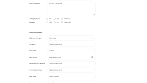
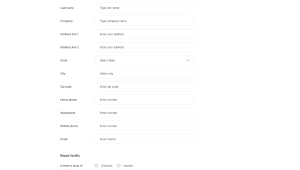
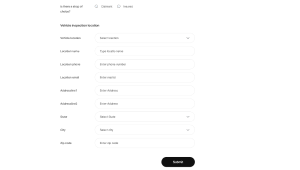

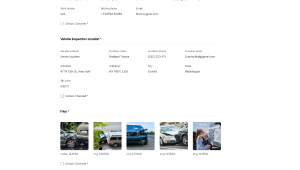


Many More...
Conclusion
The Estimator Based on Insurance" successfully addressed the challenges faced by estimators and auditors in the automotive industry. By focusing on user needs and creating a platform that was both powerful and easy to use, we were able to make a real impact on their daily workflow. The project was a testament to the power of thoughtful design and user-centered development, resulting in a tool that not only met but exceeded expectations.
Figma Link Saikiran chilkamari